An interactive and highly converting landing page design for a software brand that helps users create high-quality images and videos using Artificial Intelligence.

UI Design Showcase
Artistiq Landing Page UI Design
YEAR
2026
ROLE
Visual Designer
Interaction Designer
SKILLS DELIVERED
Website Design
Prototype Design
UI Animation
Context
This design was created to solve two problems:
1. To help potential users understand the full capabilities of the AI tools offered by Artistiq, even before they click sign-up.
2. To ensure that the landing page converts more users.
FIRST STEPS
Creating a highly-converting landing page through an immersive experience
Design Thinking
To create this landing page, I decided to prioritize visuals (images, videos and micro-interactions) to catch the users’ attention on first page-visit.
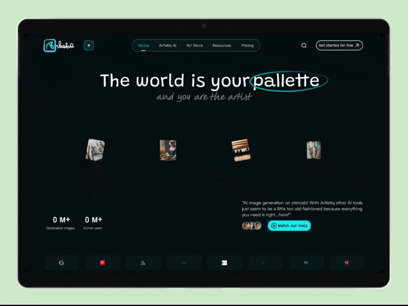
A website visitor starts from the hero section with a strong copy “the world is your palette, and you are the artist”, scrolls down sections with high-resolution shots and demos, a section that showed available plans they could pick from, and finally end up in a call-to-action (CTA) section with another strong copy “Want to skyrocket your Creativity? Get started.”
This layout was structured to expose visitors to the AI tools’ features and the value they stood to gain by purchasing a plan, while immersing them in a taste of the experience.
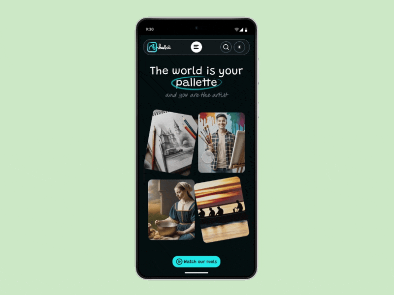
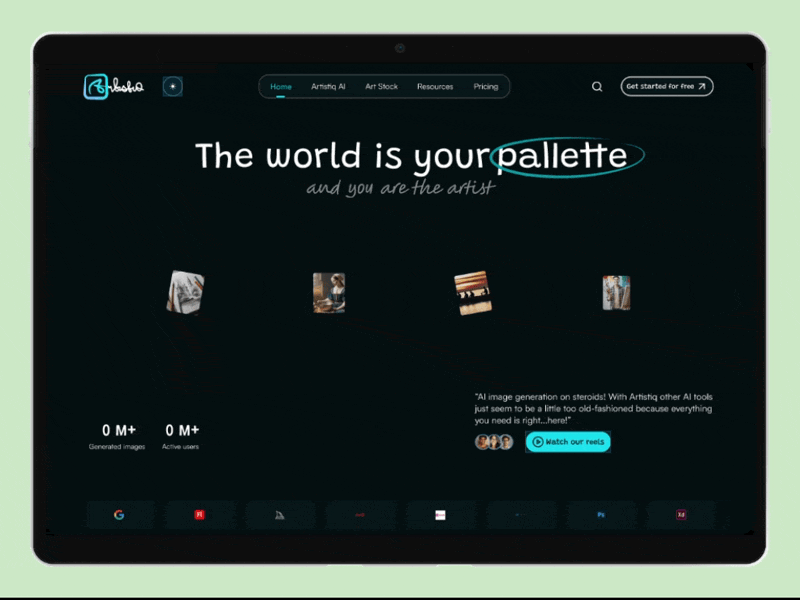
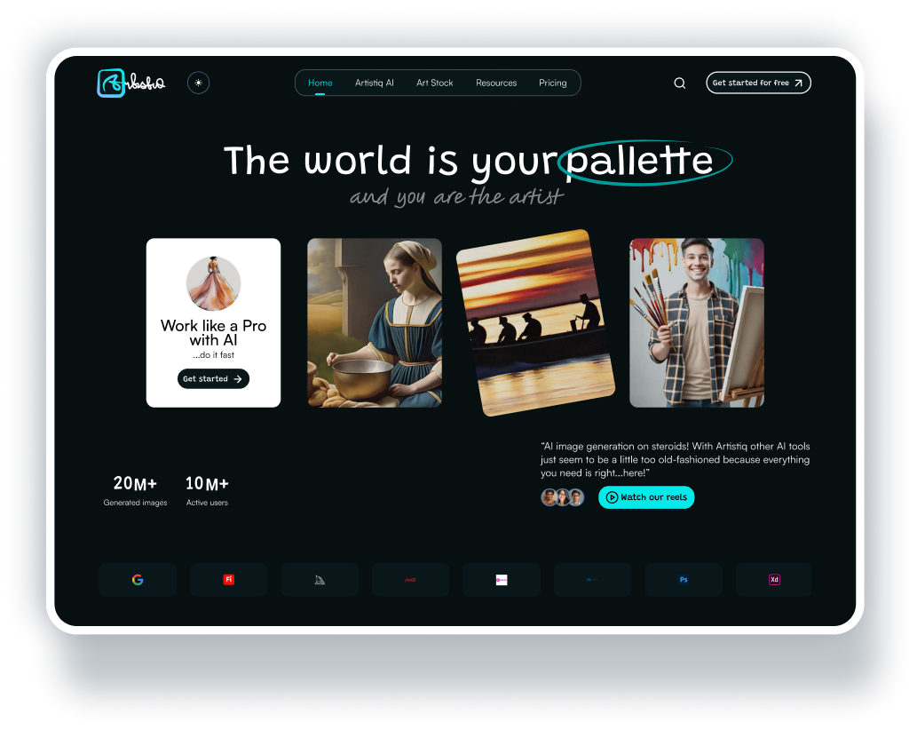
Landing page Hero Section with interactive feature cards.
Micro-interactions & Motion
Next up, I used subtle motion to guide website visitors’ attention and simulate AI-powered media generation in real time.
Motion Demo to simulate AI-powered media generation.
Conversion Strategy
To design this UI, it was important to design for conversions (since that is what the goal of every landing page is) so my conversion strategy was simple.
First, the call-to-action had to be placed intentionally to ensure that a website visitor would be able to quickly sign up/purchase a plan.
Next, it was important to win potential customers’ trust through review highlights and an animated trust section showing brand partners.
A follow-up strategy was to place a Plans section showing the various ways a customer could subscribe to the service, after they must have scrolled down the page, closely followed by a FAQs sections to answer common questions customers often ask before signing up or subscribing to a plan.
Finally, another CTA was placed right before the footer, after the FAQs section as a final strategic grab at the customer, to signup.
Tools
Figma, Lovable AI.
UI DESIGN BREAKDOWN
Landing Page Sections & Features
Banner Section
I designed a hero-section with visually compelling imagery and CTAs within hover cards to communicate the product’s AI capabilities.
Impact: Improves first impression, reduces bounce rate and encourages early, immersive web visitor engagement.
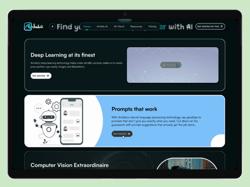
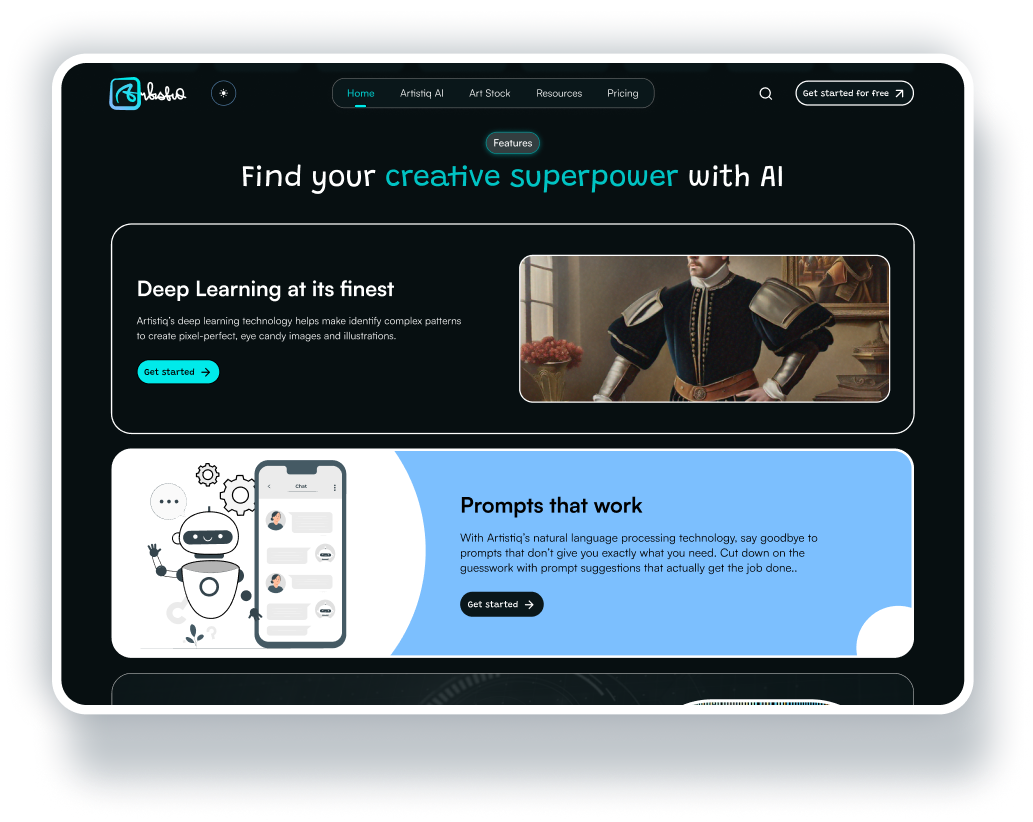
Features Section
I rearranged and organized the product’s AI features (image, video, animations) that, on the eye, could be a little complex to explain, into simple blocks. I used sticky scrolling boxes to communicate value, and a simple copy instead of technical jargon.
Impact: Helps users quickly get a hang of the product’s value, increases future feature adoption by website visitors and increases conversion.
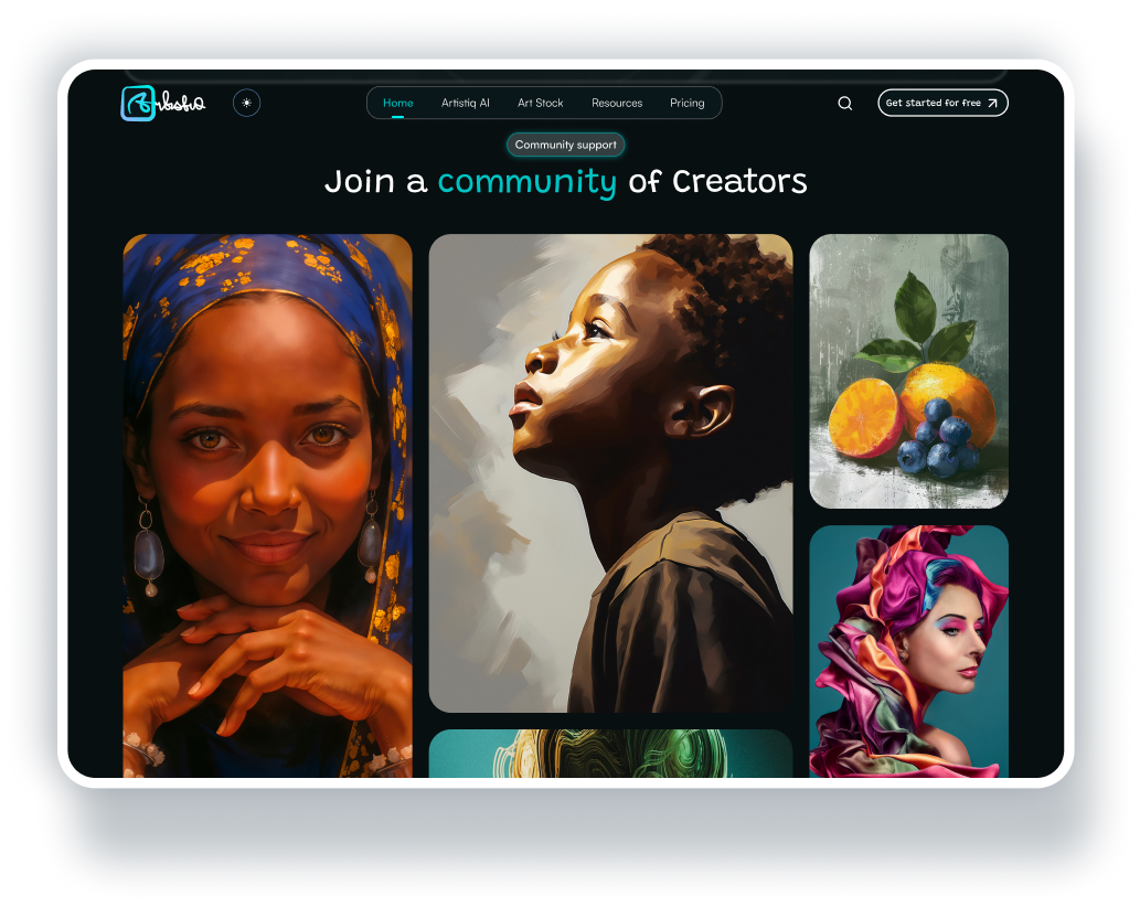
Community Projects Section
Social proof is everything, and has been known to help win user trust. Hence, I incorporated a Community projects section to show real user projects and output. This section features a bento grid with hover states and previews to encourage web visitor exploration.
Impact: builds customer trust and encourages signup through relatability.
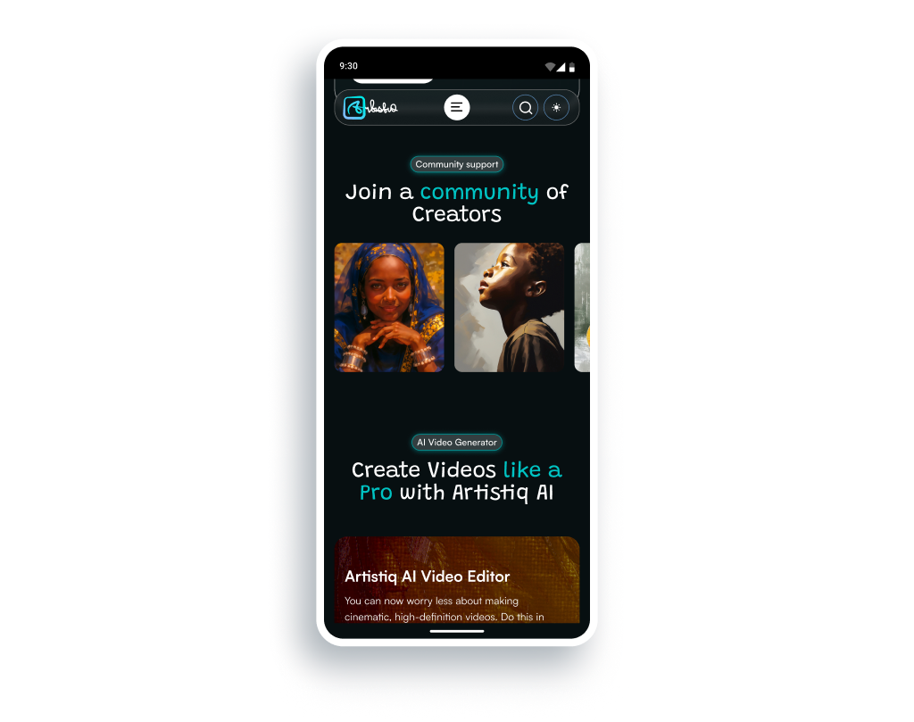
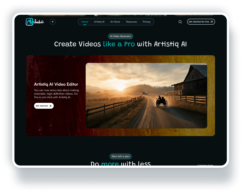
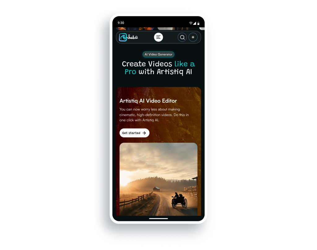
AI Video Generator Section
I created a section that spotlights one of the product’s capabilities: AI Video Generation. This section featured a gif showing a video generated by the tool, aligned horizontally (vertically on mobile) with a simple text group to further drive overall customer appeal.
Impact: Leads to feature discovery and increases user engagement.
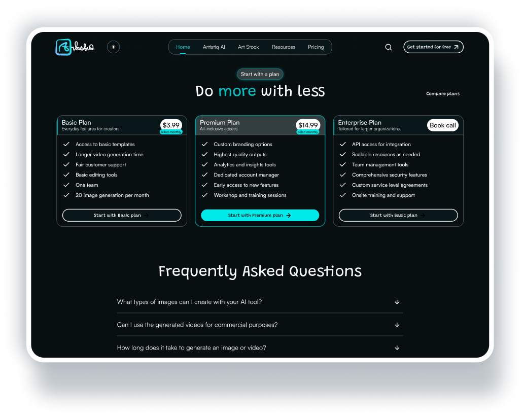
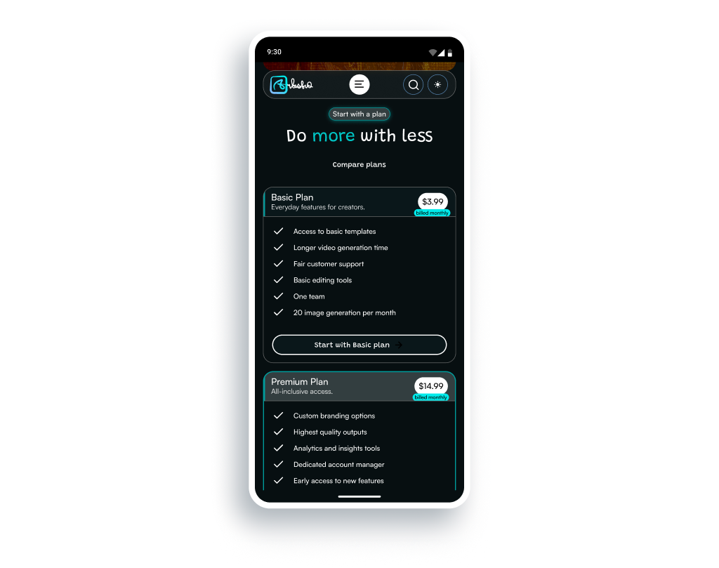
Plans Section
This section featured product pricing tiers with obvious visual hierarchy and differentiation. The layout was structured to help users pick a plan that suits their needs and budget easily. A “compare plans” button was also incorporated to help visitors understand offerings through plans comparison.
Impact: Increases conversion rates by helping customers make faster purchasing decisions.
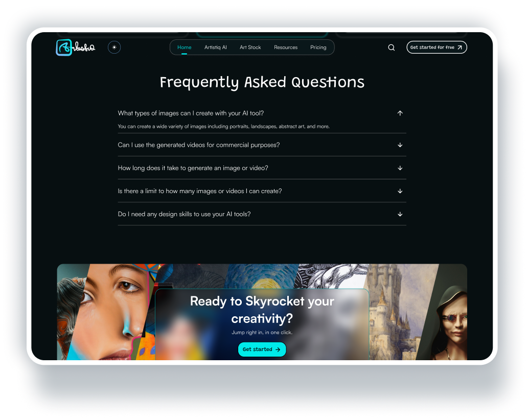
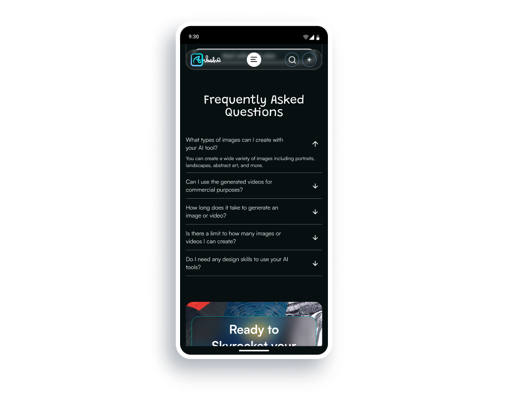
Frequently Asked Questions (FAQs) Section
The landing page also features a section where website visitors could find common questions asked by customers and answers to these questions. This section is an extra convincing chip to reassure users about the product and what they stood to gain from signing up and/or purchasing a plan.
Impact: Increases customer trust and conversion rates by speeding-up customer decision-making process.
RESULTS
Key Outcomes
Improved logical flow
The landing page helped customers flow from headline to call-to-action (CTA) while engaging in an immersive, trust-building experience and with minimal distractions.
Focused single goal
The landing page had a single, primary action, i.e. “Get Started”, to cut-down on cognitive overload.
High-quality visuals & visual hierarchy
The landing page adopted the Headline-Benefits-CTA visual flow and ensured that this hierarchy was the key information that website visitors focused on.
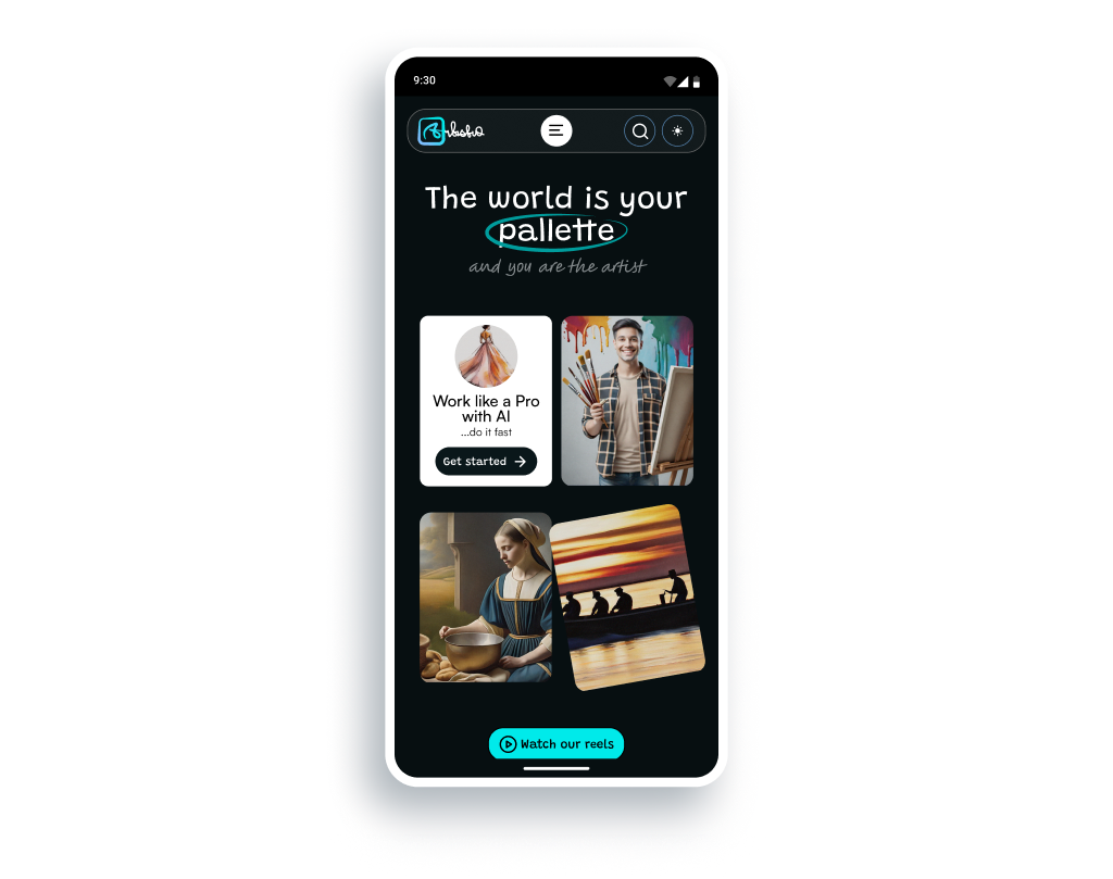
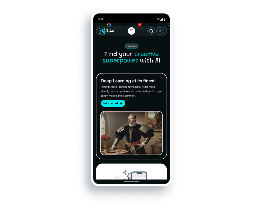
Mobile-first experience
The landing page layout was fully optimized for mobile users, since a significant amount of website traffic comes from mobile devices.
IMPROVEMENT OPPORTUNITIES
Reflections & Next Steps
Add a “see how it works” section to the landing page
This is an extra step that I believe would make the landing page convert more website visitors into paying customers. This section would feature a secondary call-to-action, where customers would be able to click a button to quickly try one of the product’s AI tools, without signing up or subscribing to a plan.
If the customer liked what they saw and wanted to proceed with actions like downloading or sharing of their AI generated visuals, they’d be asked to sign up and/or purchase a plan.
Add more sections as the product’s capabilities expand
As the product’s capabilities expand and more features are added, extra sections would be added to the landing page to further increase conversions.