AI-powered assistant to help improve the experiences of users and help them get better results when prompting, through human-like conversations and more clarified feedback.
UX Case Study
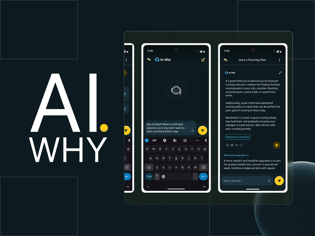
AI Why Conversational Assistant UI Design
YEAR
2025
ROLE
Visual Designer
Interaction Designer
UX Researcher
SKILLS DELIVERED
Prototype Design
UI Animation
Usability Testing
Introduction
It is no news that artificial intelligence is taking the world by a storm. From the advent of “smart” chatbots, to Large Language Models (LLMs) and well…ChatGPT.
Since OpenAI launched ChatGPT 3.5 as a free tool in 2022, LLMs like Gemini, Claude and others have sprung up, generating helpful responses to assist individuals and professionals in many spheres.
However, even with the popularity of Chat GPT and other LLMs, many of these AI language models fell short, when required to explain their responses to prompts and ask clarifying questions to help users get better feedback during a prompt-and-response action while using these technologies.
And this is where the AI Why chatbot app comes in.
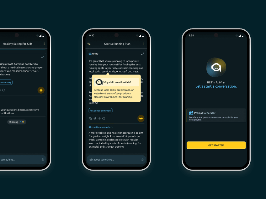
I worked with Scott (product owner) and team of engineers to design and prototype the interfaces of AI.Why; a conversational assistant powered by Meta’s Llama 3, with enhanced response features.
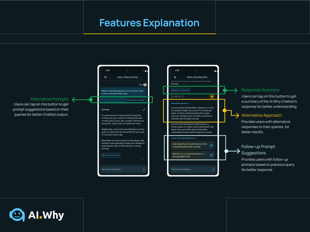
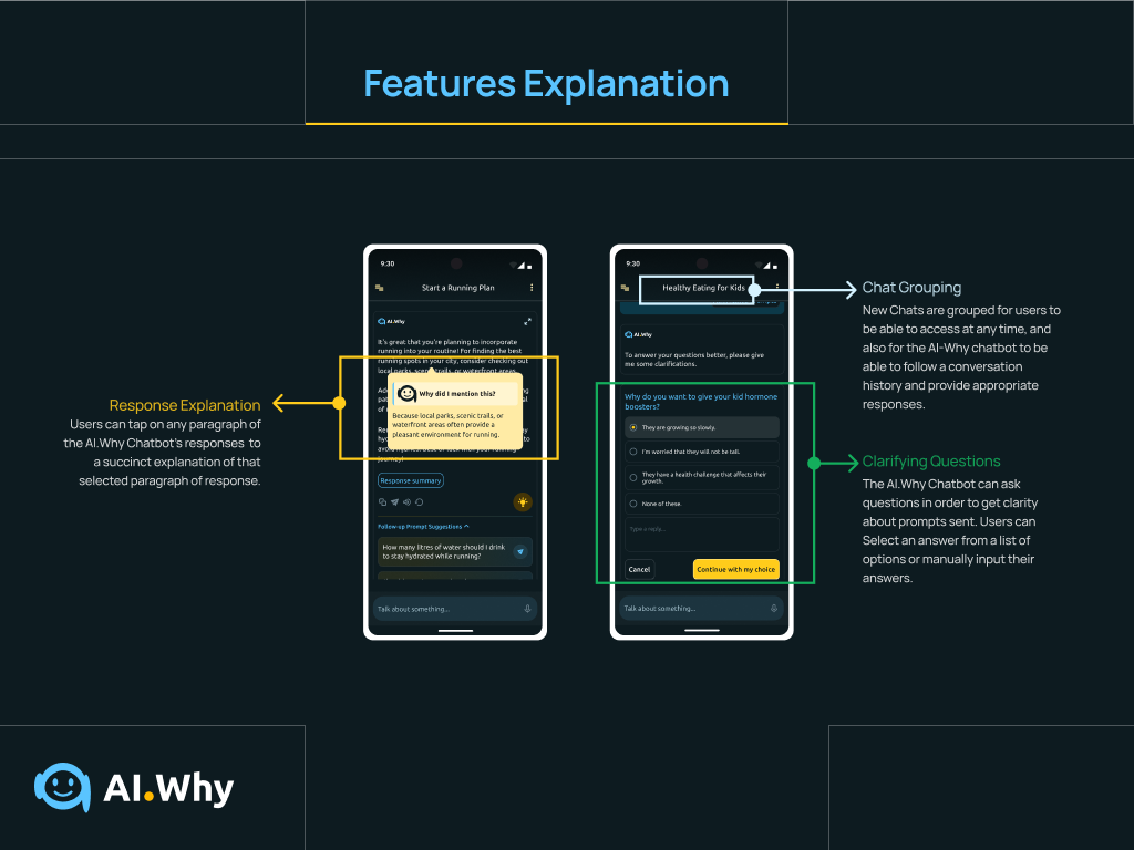
These enhanced features help users, in addition to the regular prompt-and response cycle, get explanations to parts of AI chatbot responses, get more clarified answers to prompts, help users create better prompts with alternative prompts and follow-up prompt suggestions, and also feature smart switching and chat grouping functionalities.
This app intends to simplify prompt generation and amplify positive results derived from the usage of LLMs by a broad sphere of users.
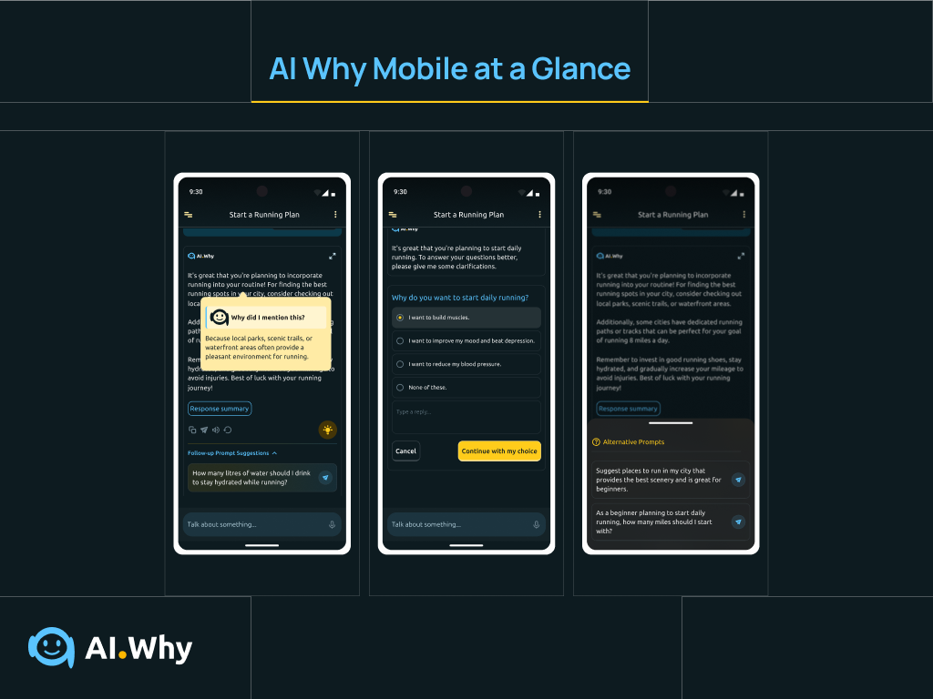
The AI Why Conversational Assistant App at a glance
FIRST STEPS
Creating a user-centric Product Through Research
Kicking things off…
help users who find it difficult getting valuable outcomes while using chatbots, get better results through interactive features that will help increase their productivity.
To measure if I successfully solved users’ needs with this app, I would monitor how easily users could find their way through the app, the number of users who successfully completed discussions in the shortest time on the app, and the time users would expend, while completing a discussion the app.
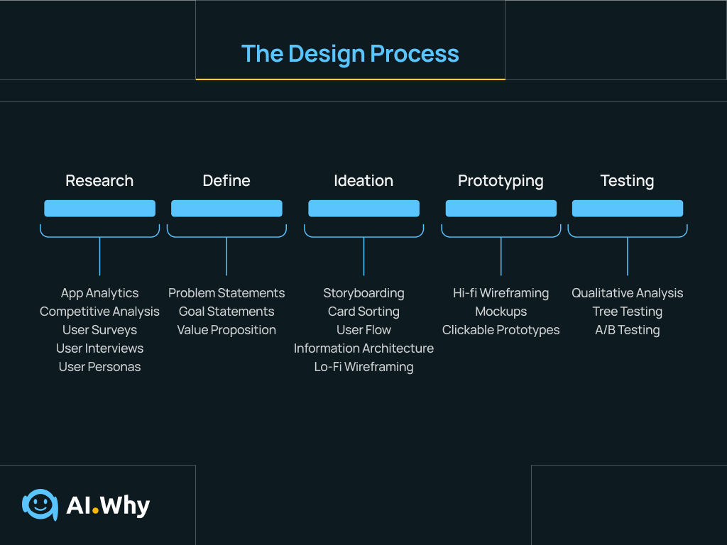
Image showing the design process adopted for this project. It is important to note that my process was not exactly linear but iterative. The process steps outlined however, served to ensure that the project was as user-centric as possible.
Competitive Analysis
To begin the research, I needed to carry out competitive study on existing AI-powered chatbots, and conversational interfaces (voice assistants), in order to determine what features were already offered by these technologies and what features were missing.
I focused on three direct competitors: ChatGPT, Gemini AI and an indirect competitor: Voice Assistants.
I decided to explore voice assistants in my competitive study, because they were AI technologies that provided some of the features we wanted to incorporate into the app, like, providing follow-up responses and asking clarifying questions.
Competitive Audit table showing strengths and weaknesses of existing chatbots and LLMs (Chat GPT, Gemini, Ask AI and some voice assistants).
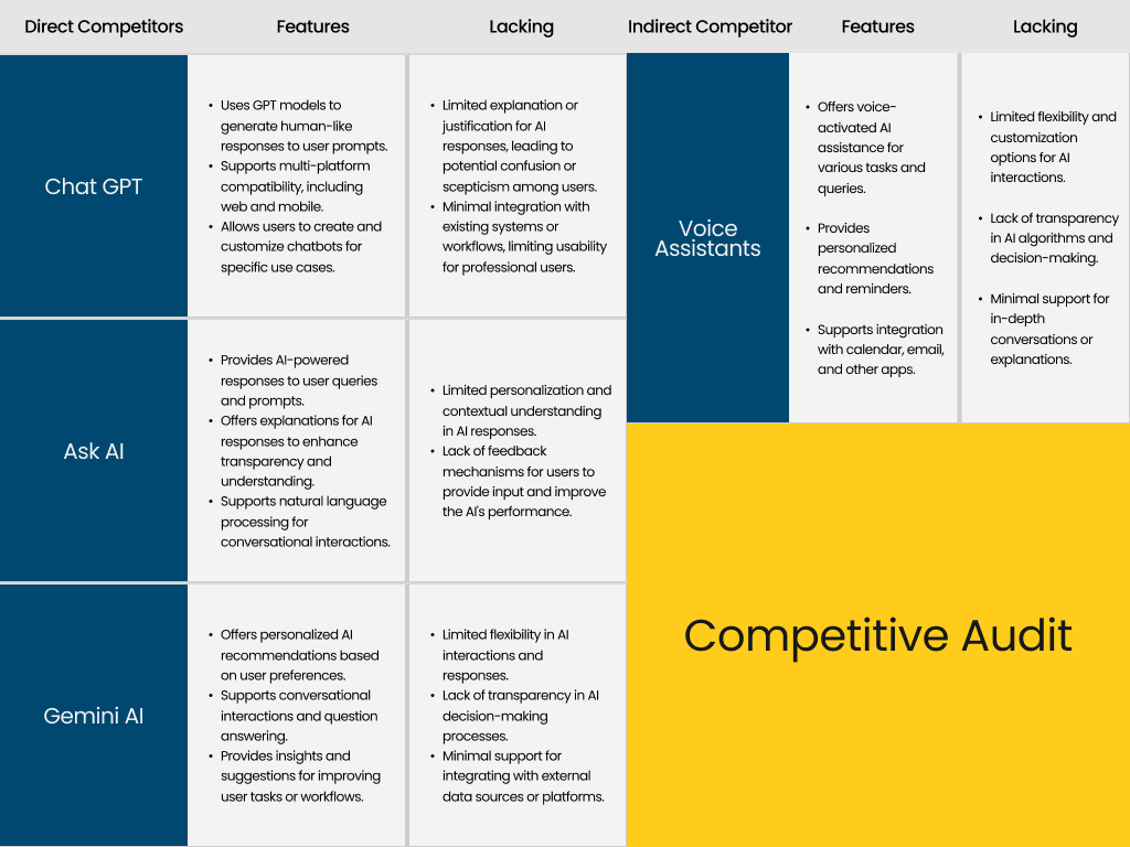
Insights from Competitive Analysis
My research revealed that ChatGPT, Ask AI and Gemini AI had limited to zero support for discussion categorization.
Also, all understudied AI chatbots except Ask AI, had limited support for response explanations and summaries, and none of the chatbots provided features to explain isolated parts of their responses.
This revealed new insights on the “WHAT” (features to design, to give a competitive edge), however, further research was needed to figure out the “WHY”, that is, the value proposition (usefulness to users) of such features in our app.
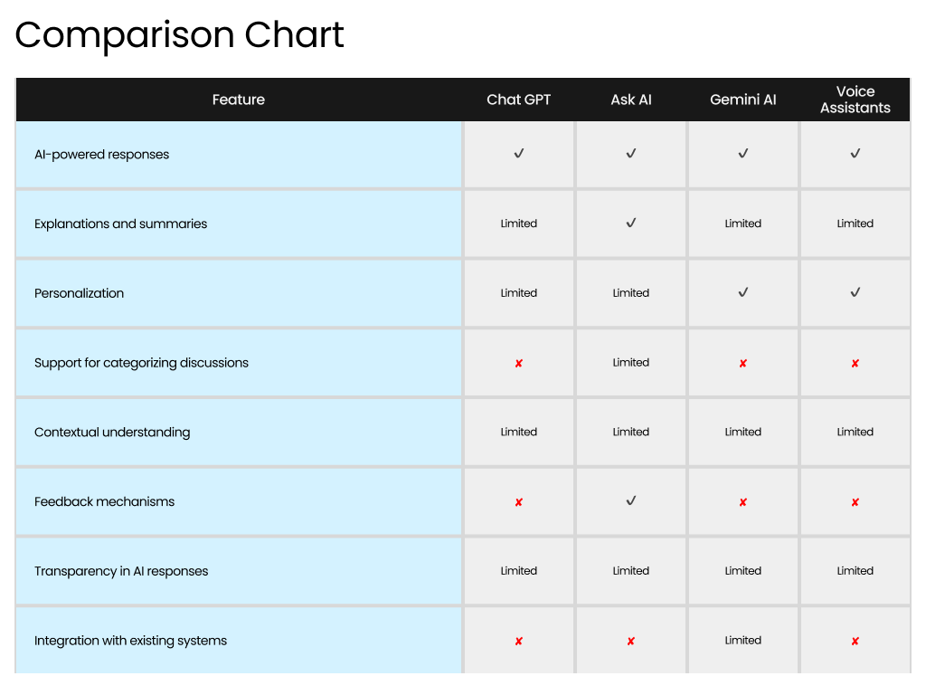
Comparison Chart showing features that we wanted the AI Why app to have and the presence of these features in existing competitors.
Empathizing with the user
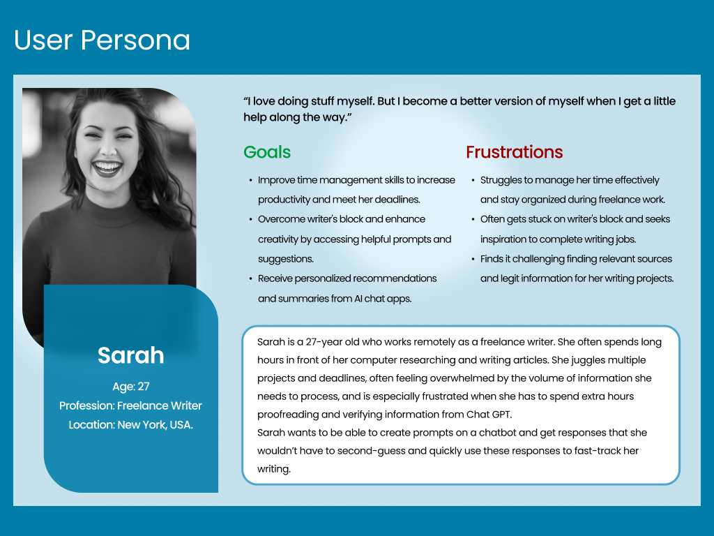
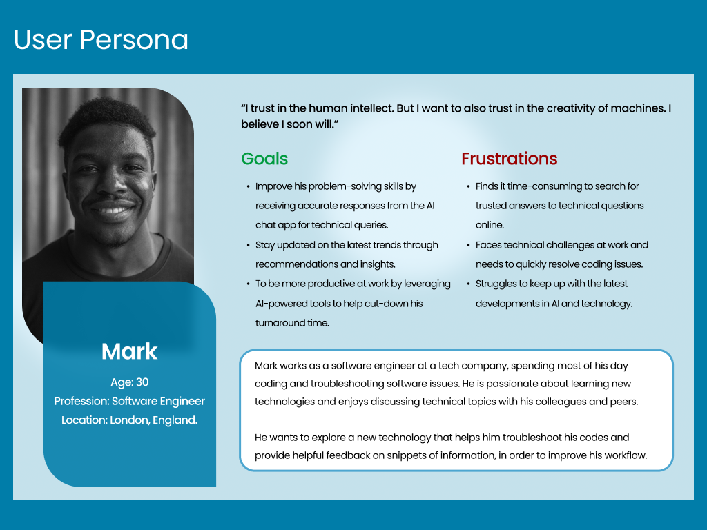
After competitive analysis, I conducted a screener survey to recruit users whose experiences with chatbots and voice assistants, were determined to be beneficial to the study.
I conducted virtual interviews with six users in participation to learn about users’ goals, expectations and pain points.
Using user feedback, I created two user personas.
Woohoo! Insights…
My research revealed some helpful insights about user behavior and how they interact with AI chatbots.
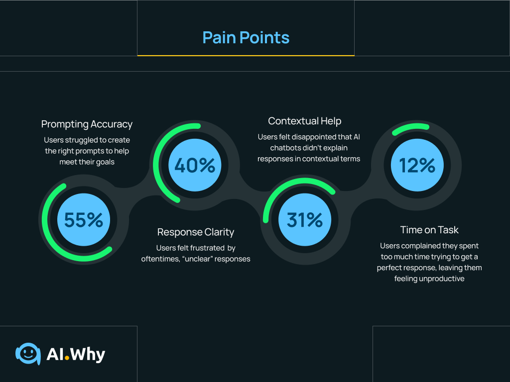
All groups of users confessed to struggling with generating the right prompts in order to get helpful responses to solve their problems and believed that their usage of AI chatbots would increase, if they got a little extra help.
Also, roughly 70% of users said it took “longer than necessary” to get the perfect responses that they were looking for, from AI chatbots.
FIGURING OUT THE “HOW-S”
Defining Problems and Ideating Solutions
Problem Statement
At this point, I had a better understanding of users’ pain points. But the journey was far from over. In fact, I had only just begun.
To ensure that I stick to the main goal of this project, I drafted out a problem statement:
“AI chatbot users need to quickly and easily get the best responses to their prompts in order to maximize their productivity, because it is currently difficult to find chatbots which provides helpful assistance, so they don’t feel frustrated and overwhelmed.”
Pain Points that users encountered while interacting with other Chatbots and LLMs. These pain points were used to create the Problem Statement that fueled this research.
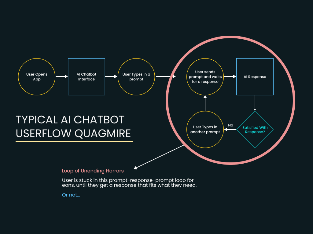
Mapping out the User Flow of the AI Why App
Insights from research revealed that users often abandoned the experience whenever they don’t get the responses that they are looking for, minutes into using AI chatbots.
Users seemed to be trapped in a prompt-response-prompt loop (which I called the Loop of Unending Horrors) that made them feel stuck and unproductive.
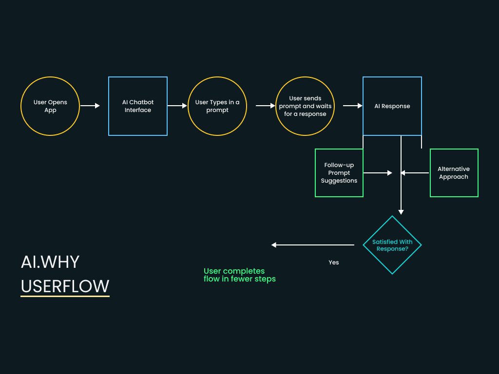
It was therefore important to ideate features to incorporate into the app, which would take users out of this loop, and make the user’s flow through the app more productive.
Wireframing the AI Experience
Getting started with the design, I asked these questions:
“How do I incorporate all these features and still make the interaction of this chatbot memorable?”
“How do I solve the users’ problems in the shortest number of steps?”
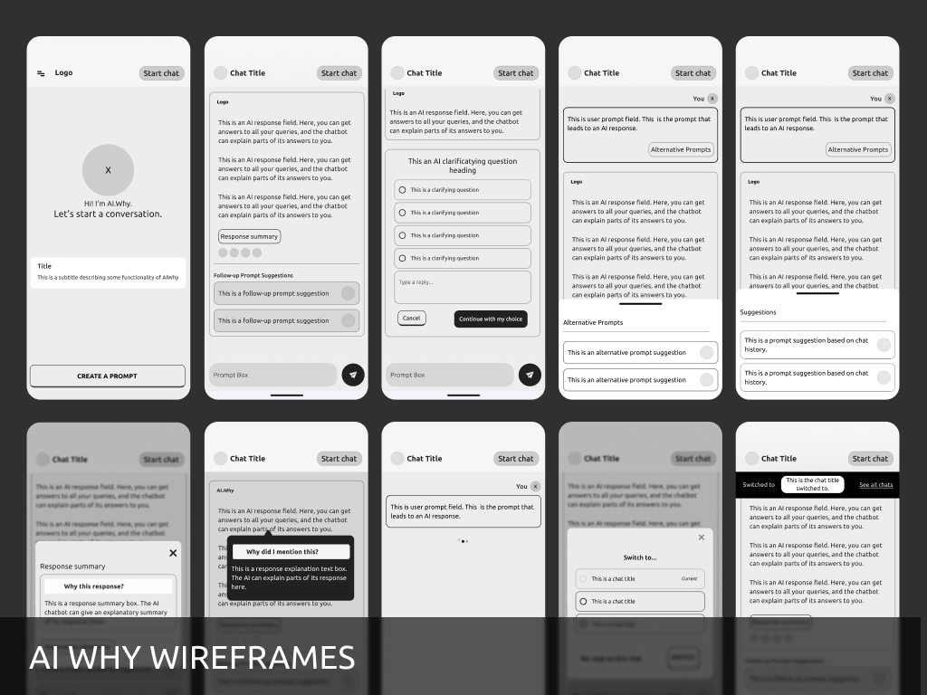
I drew out digital wireframes, printed them out and conducted A/B testing on social media and groups, to determine the layouts that users found simple and intuitive.
Users preferred a playful, yet interactive approach to creating better prompts and getting explanations for responses.
Using feedback from users, the wireframes were refined until what was left was a design structure that was familiar, yet improved and enjoyable.
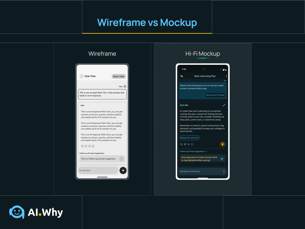
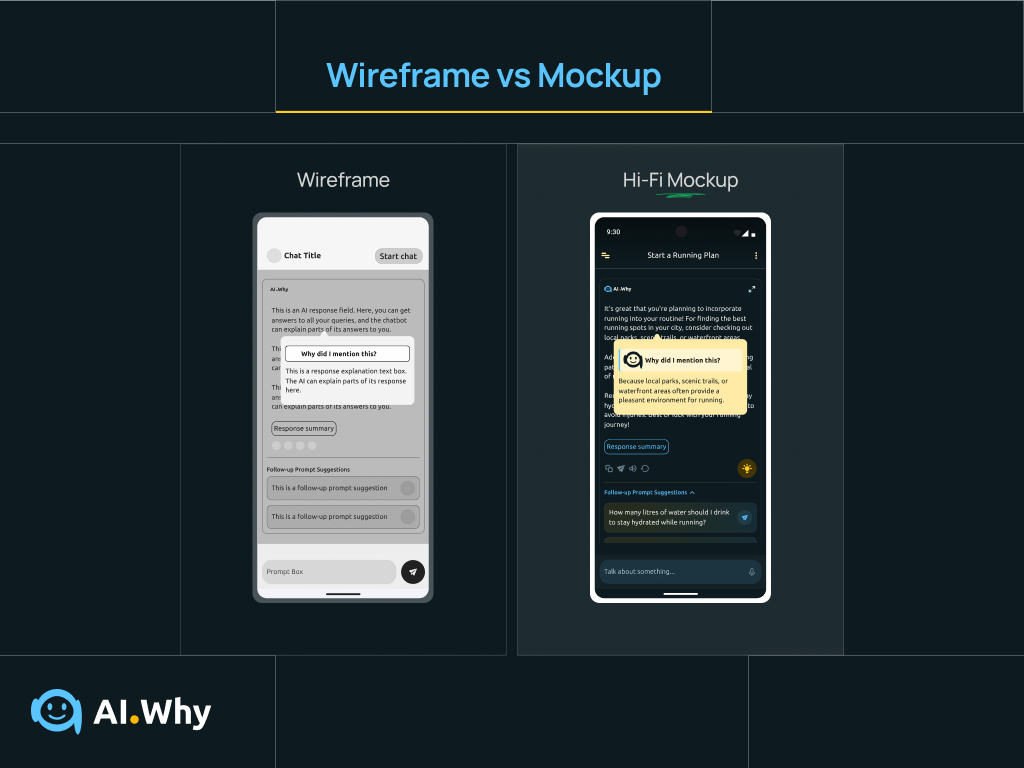
High-fidelity wireframes of the AI Why app user interface.
THE DESIGN PROCESS
Creating Simple & Functional Interfaces
Transitioning from Wireframes to High-fidelity Mockups
The next step was to convert the digital wireframes into high fidelity mockups and clickable prototypes in Figma; I had to consider how users typically interacted with colors and text.
From A/B Testing, users wanted an app that had catchy and relaxing color variations. They also wanted text to be readable and to be able to use features like response explanation and summary, without leaving their current flow.
It was tasking incorporating all these features in the prototype while considering design intuitiveness. Scott was really helpful, providing high-level feedback.
I also created a component library of all design assets were synchronized across a diverse range of platforms.
Setting up the Conversational Interface for Success
While converting the wireframes of the AI Why app into high-fidelity mockups, it was important to ensure that the structure and layout of the conversational interface was in such a way as to help users converse with the AI assistant, without getting bogged down by too much information which could cause user confusion.
With this in mind, each AI response was trailed by collapsible accordions where users could find alternative responses to their questions and follow-up prompt suggestions.
Prototyping the Users’ Experience
The next challenge was to create high fidelity prototypes to simulate how a typical user would interact with the conversational assistant. At this point, I referred back to the user flow created earlier to ensure that every link was in line with information gotten earlier from research.
The result? A highly interactive and intuitive conversational experience that got positive remarks from 95% of users during testing.
Guerilla Testing with Small User Group
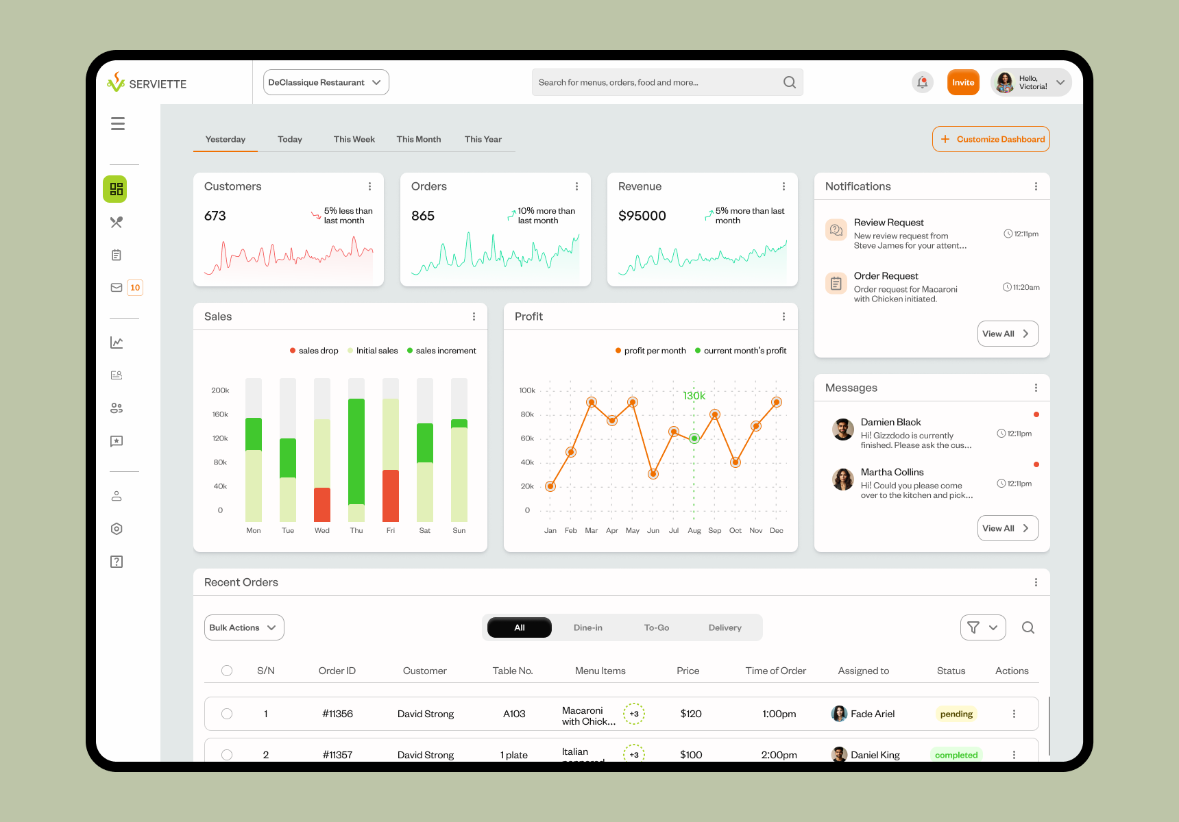
As soon as the low-fidelity wireframes were completed, we tested the layout and structure with some restaurant staff and managers and collected valuable feedback. Testers loved the structure and also gave helpful feedback about the hierarchy of sections on the Dashboard, which was used to further refine the wireframes, until an acceptable structure was gotten.
Designing High-Fidelity Mockups
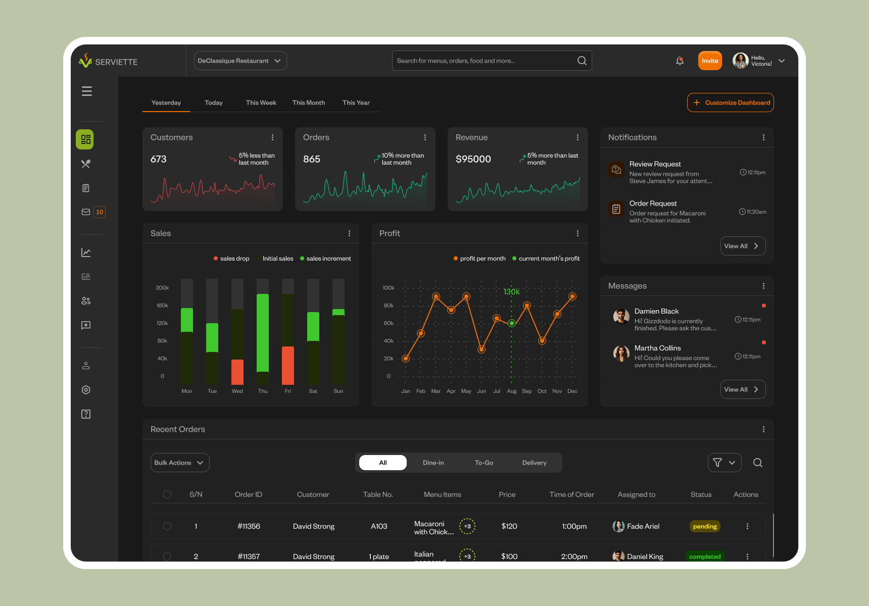
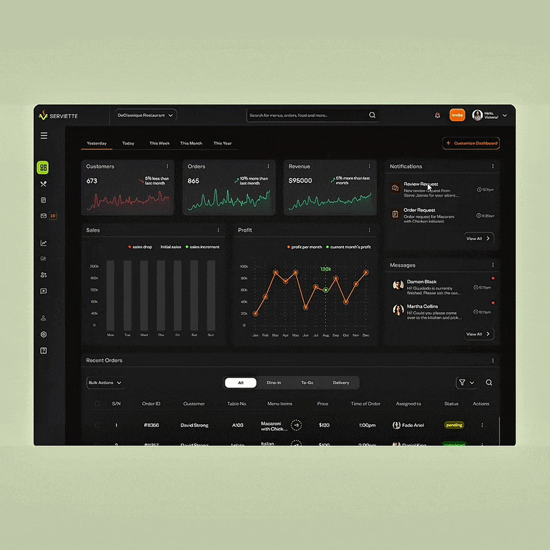
High fidelity wireframes were further refined into mockups in two modes: dark and light modes.
High-fidelity prototyping
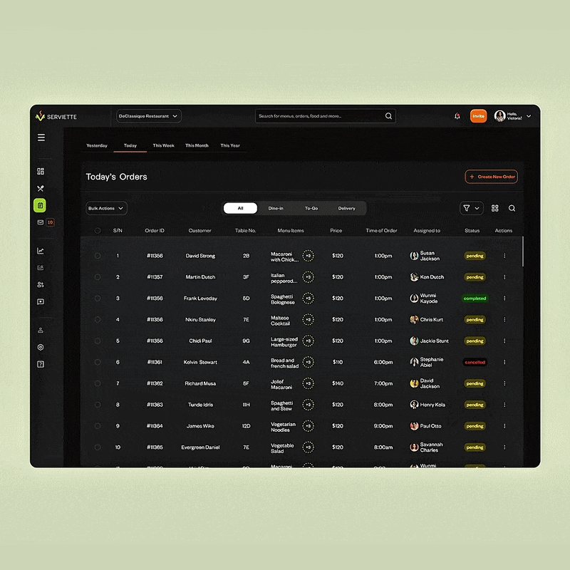
Prototyping was the next step, and using previous feedback from research, we created a user flow that was simple and straightforward, allowing users to move through pages and complete tasks in the simplest and minimal number of steps.
Serviette for Mobile
To avoid the exclusion of users who would be using their phones to log in and complete tasks on the Serviette OMS, I designed mobile interfaces. This was important especially for customers and waitstaff who would most likely be moving around a lot while interacting with the app.
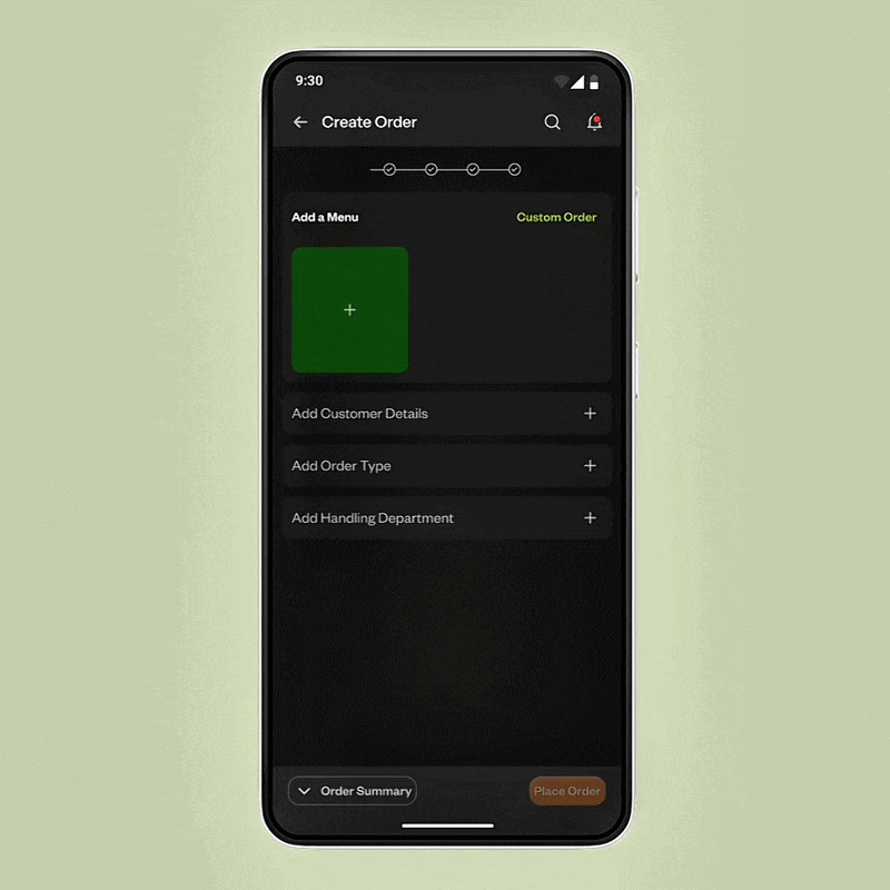
Creating an order interaction using the Serviette Mobile App. The mobile interface was designed with a simplistic approach to ensure that users enjoyed using the mobile app as much as they did the web app.
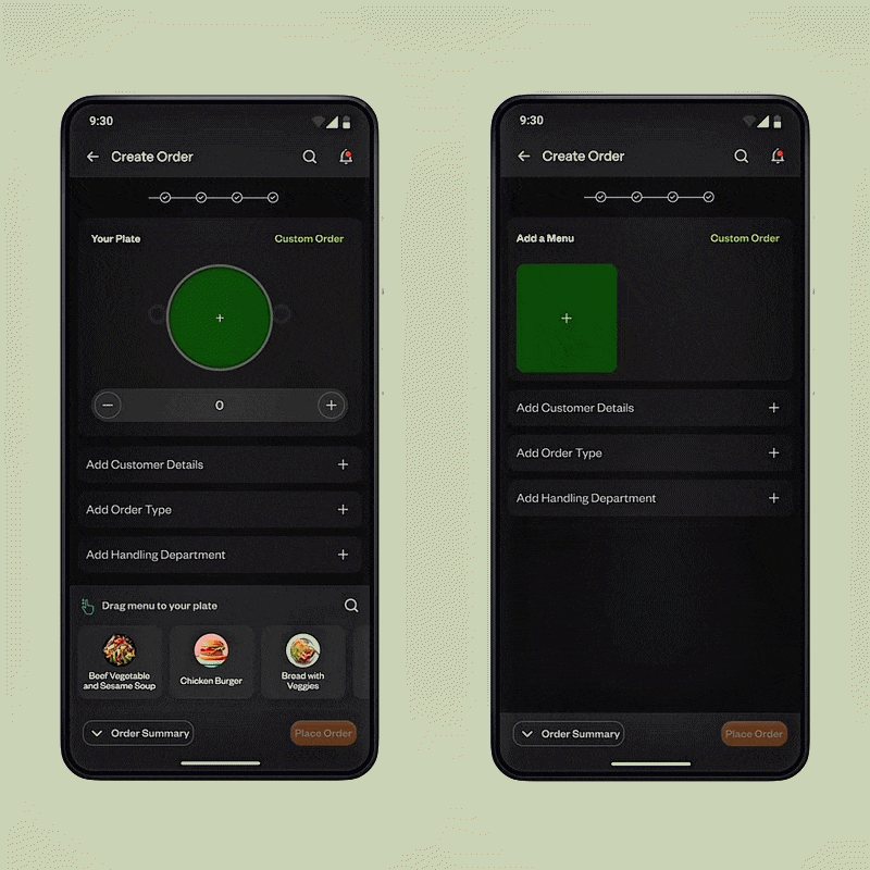
A&B Testing of Mobile Interactions for Creating an Order
During the design and prototyping of the mobile interfaces, I ran into a little problem of choice. While a user created an order, should they drag and drop a menu to a virtual plate, or should they simply tap a menu to add it to their order?
To test these two interactions, I conducted A&B tests with a different set of participants and at the end of this exercise, a greater percentage of these testers preferred to tap a menu to add it to their order.
A&B Test showing ‘Drag and Drop’ and ‘Tap to Add’ interactions.
RESULTS
Outcomes & Impact
Dealing with Constraints
Restaurants come in all shapes and sizes. And so does restaurant inventory…from small cafes with few items to large ones with complex menus.
We wanted the OMS to scale up and down to adapt to different restaurant’s needs. To deal with this, we introduced features for menu customization and flexible user flows to adapt to different restaurant workflow complexity levels.
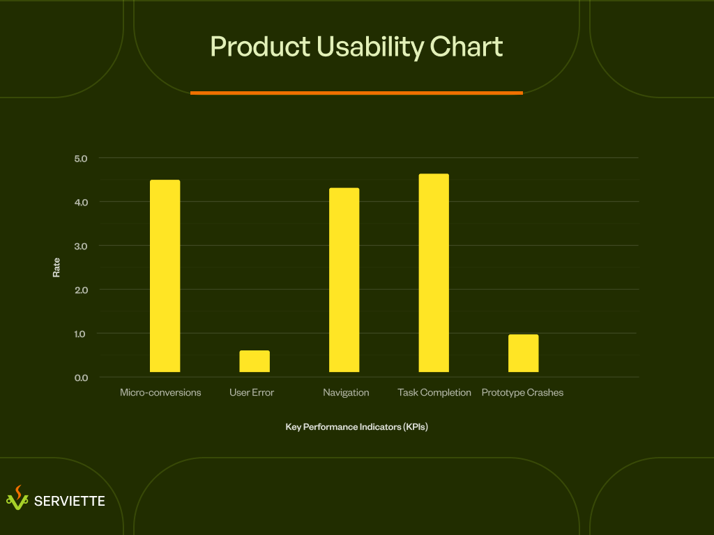
Usability Testing & Feedback
During usability testing, 91% of test participants gave positive feedback about the user interfaces of the Serviette OMS and were excited about adopting the app in their Restaurants.
Product Usability Chart showing how users interacted with the prototypes during usability testing.
WHERE DO WE GO FROM HERE?
Next Steps
Create an AI-powered Order Management Assistant
During the design of the Serviette order management system, integrating an AI-powered order management assistant to help both waitstaff and customers create and manage orders, was skipped due to time constraints.
A next step for this product would be to design and build an AI assistant and agent that would help make the process of completing tasks on the app easier and faster.