All-in-one mobile and web application design for Investe: a startup fintech company that offers B2C and B2B financial solutions to end users.
UI Design Showcase
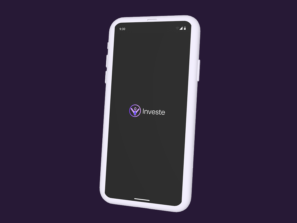
Investe Fintech App UI Design

YEAR
2025
ROLE
Visual Designer
Interaction Designer
SKILLS DELIVERED
Design System Development
Prototype Design
UI Animation
Introduction
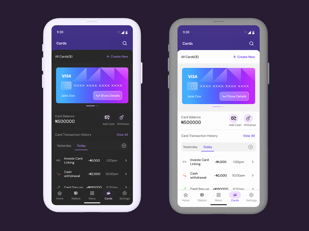
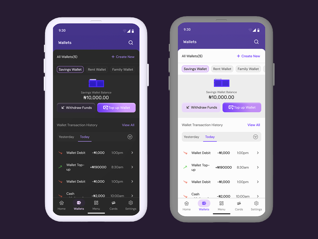
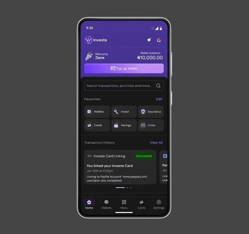
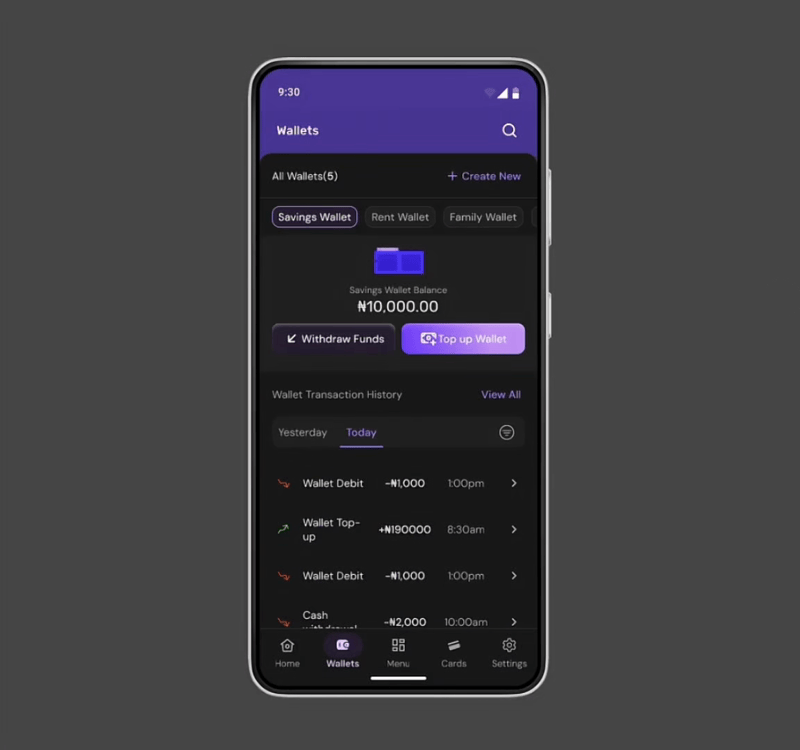
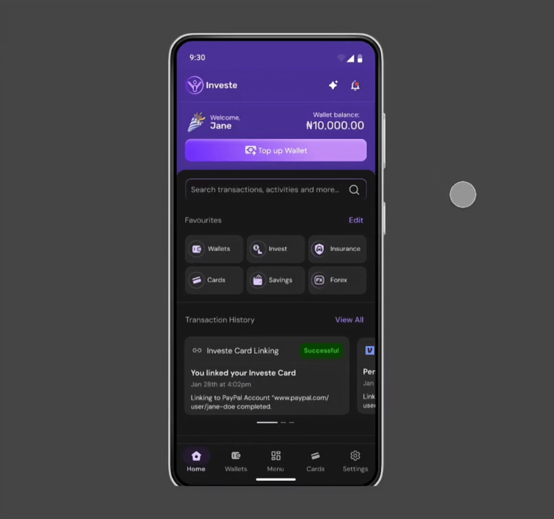
Investe Fintech app was designed to help individuals and businesses perform multiple financial services in one app. Some of the features we implemented for this app includes virtual wallets and cards, investment and stock exchange, bills payment savings and insurance system.
DESIGN CONSISTENCY DEVELOPMENT
Creating a Design System that Works
Setting up the brand for success through styles
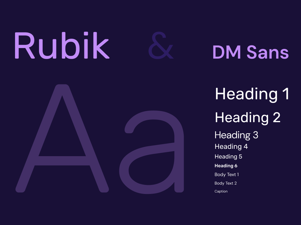
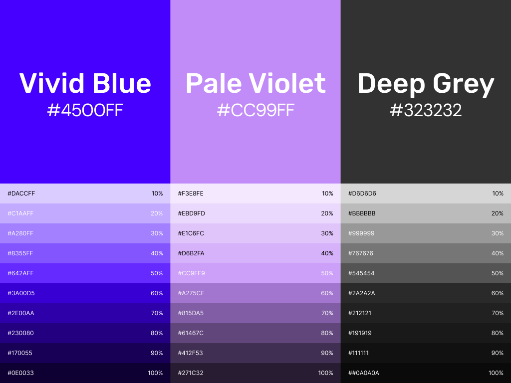
To begin this project, it was important to define styling principles that told the brand’s story. I opted for a font combination of Rubik for headings and DM Sans for body texts and captions. Also, the brand’s existing colors were vivid blue and pale violet, so I balanced it up with shades of deep grey for backgrounds and text.
Creating Design Tokens
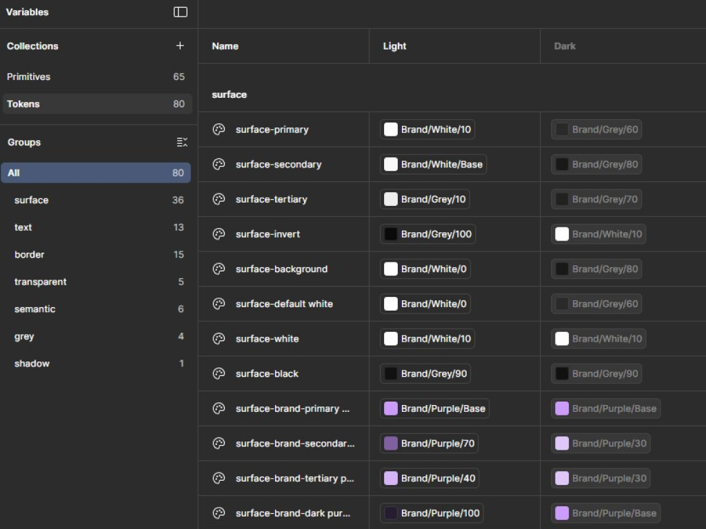
After the brand styles had been defined, the next step I took was to create design tokens using the variable creation functionality on the Figma app. I defined naming conventions to ensure that the design worked very well, when being coded by the developers, which in the long run would ensure scalability.
Snapshot showing tokens and naming conventions of the Investe App UI Design system.
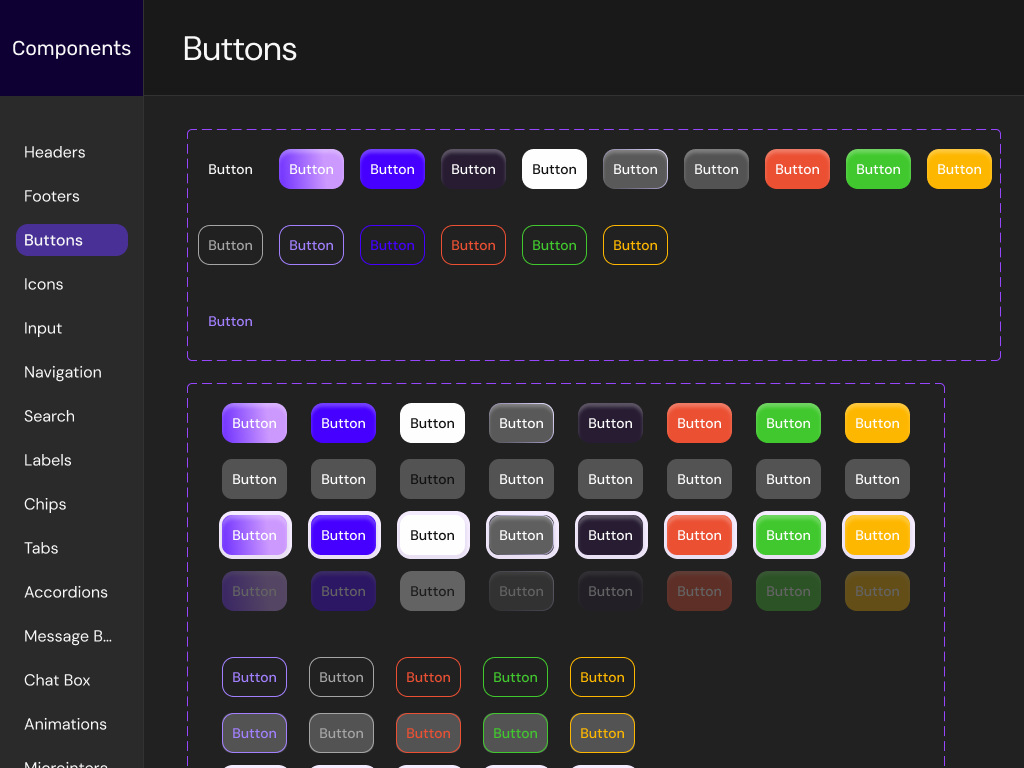
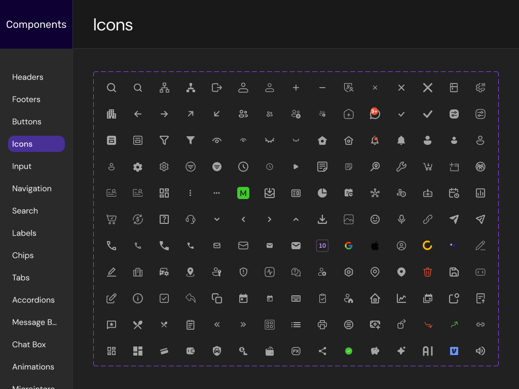
Building a Component Library
At this point in the design process, it was time to create a library of reusable components. I built out components for design elements like buttons, input, navigation and more, to ensure uniformity across all brand products.
It was a tough journey that I painstakingly followed through while carrying members of my team along; with everyone contributing through high-level feedback during design reviews.
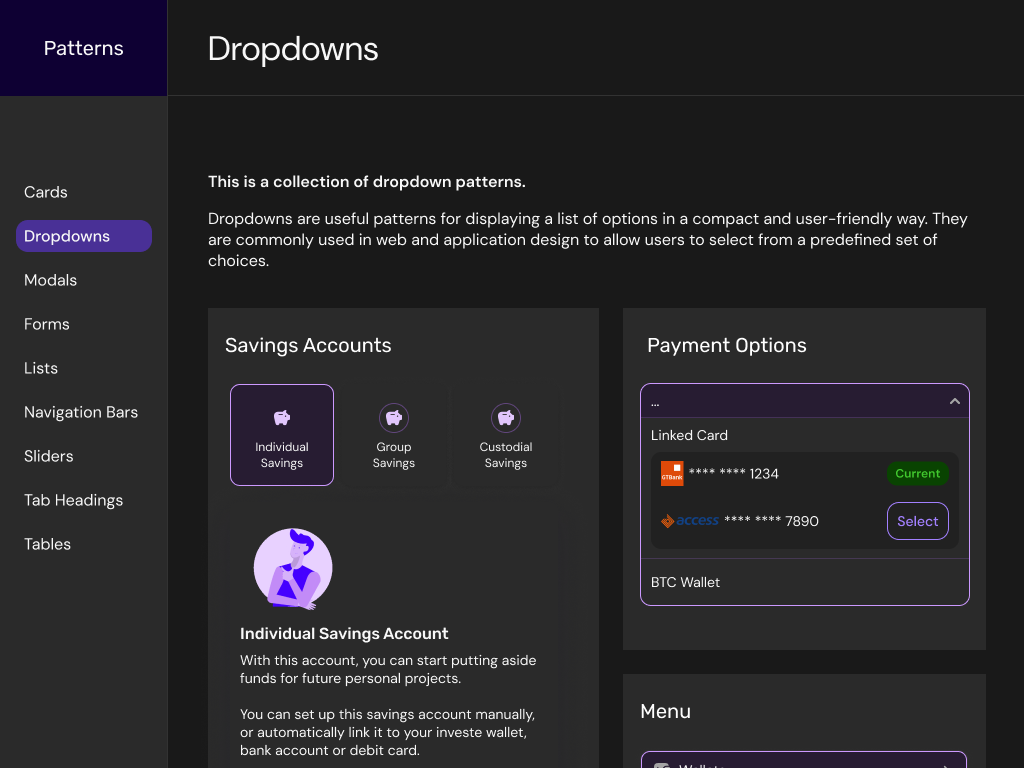
Pattern Library for a Uniform Design
At this stage, it was time to group components together to establish the structure of the app’s user interface. We brainstormed different layout patterns, testing for usability and checking if layouts improved the look and feel of the app’s interfaces and elevated the overall user experience.
Image showing snapshot of pattern library for the Investe Fintech App UI Design.
Documentation and Usage Guidelines
To complete the design system creation process, I collaborated with developers to create robust documentations and usage guidelines.
DESIGN & PROTOTYPING
Designing the Users’ Experience
Bringing it all together on mobile
At this stage of the design process and armed with a well-structured design system, I laid out all components on the user interface, following previously established patterns.
The interface was also created in two modes: dark and light, in line with modern design practices and to give users the ability to toggle between modes they felt more comfortable with.
Making the UI interactive with Prototyping
The next challenge was to create high fidelity prototypes to simulate how a typical user would interact with the Investe App. I ensured that I worked iteratively and tested the flow with stakeholders and a representative sample of users, to reaffirm that users’ experiences with the app were top notch.
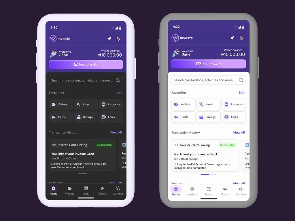
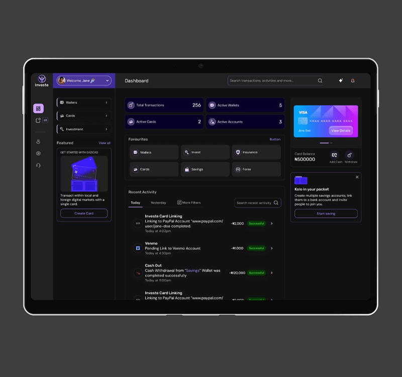
Creating a User-friendly Web App Experience
Since the Investe App was going to be available on both mobile and web platforms, I also designed intuitive web app interfaces. I opted for a simple layout to ensure that users would be able to enjoy the web experience as much as they would potentially enjoy the mobile experience.
Preview of the Dashboard prototype for the Investe Web App.
RESULTS
Outcomes, Feedback & Iteration
Dealing with new requirements
During testing, one tester said out loud “I wish there was an AI feature that would help me when I am stuck.” This wasn’t part of the deal. We didn’t plan to roll out AI features in the early versions of the app design and development.
However, stakeholders insisted that I create a basic interaction showing how an AI assistant would be accessible on the mobile app, before this feature is planned and built to scale.
To deal with this new change, I had to iterate and update the header components of the mobile and web interfaces to feature an AI assistant icon button, which when clicked, would lead users to an AI chat page.
Prototype showing how users flow from the homepage to the AI chat interfaces as they intend to initiate conversations with the Investe AI Assistant.
Revisiting and Refining the Design
I continuously subjected the prototypes created to a testing-feedback-iteration loop. This was done to ensure that all project goals and user expectations were met.
It was interesting to see how users could have really diverse opinions about a design, and though all features were not added in the first MVP, I ensured that the design was robust enough to accommodate future design modifications.
WHAT I LEARNED
Key Takeaways
Iterate, iterate, iterate
This project exposed me once again to the benefits of iteration while building a design to scale. From time-to-time, I had to revisit earlier processes to refine, discard, and change stuff.
It was interesting to see how much one’s design thinking and decisions could change, based on user/stakeholder feedback and in tandem with new insights and discoveries picked up along the design journey.
The Benefits of Adopting an Agile Attitude
I and the team worked in a fast-paced Agile environment, to ensure fast delivery of milestones and exchange of high-level feedback, round the clock.
Working Agile on this project exposed me to the benefits of teamwork, the drawback of working in silos, and showed me how close collaboration was key to success during design conceptualization and implementation.
WHERE DO WE GO FROM HERE?
Next Steps
Collect more feedback from users about the Investe App
This project outline covered the design steps I took to design the first version of the Investe App. In the coming days, I will be collecting more feedback from users about their experience with the app, and this data is going to inform the decision-making process for the features to include or remove, in the next update.